CLIENT
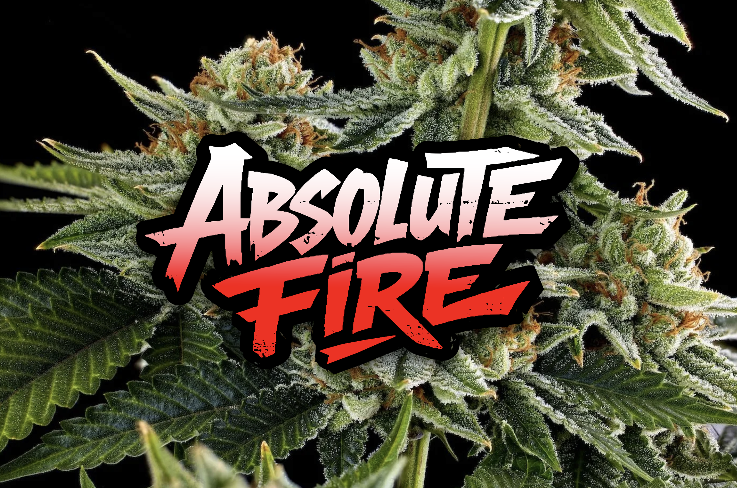
ABSOLUTE FIRE
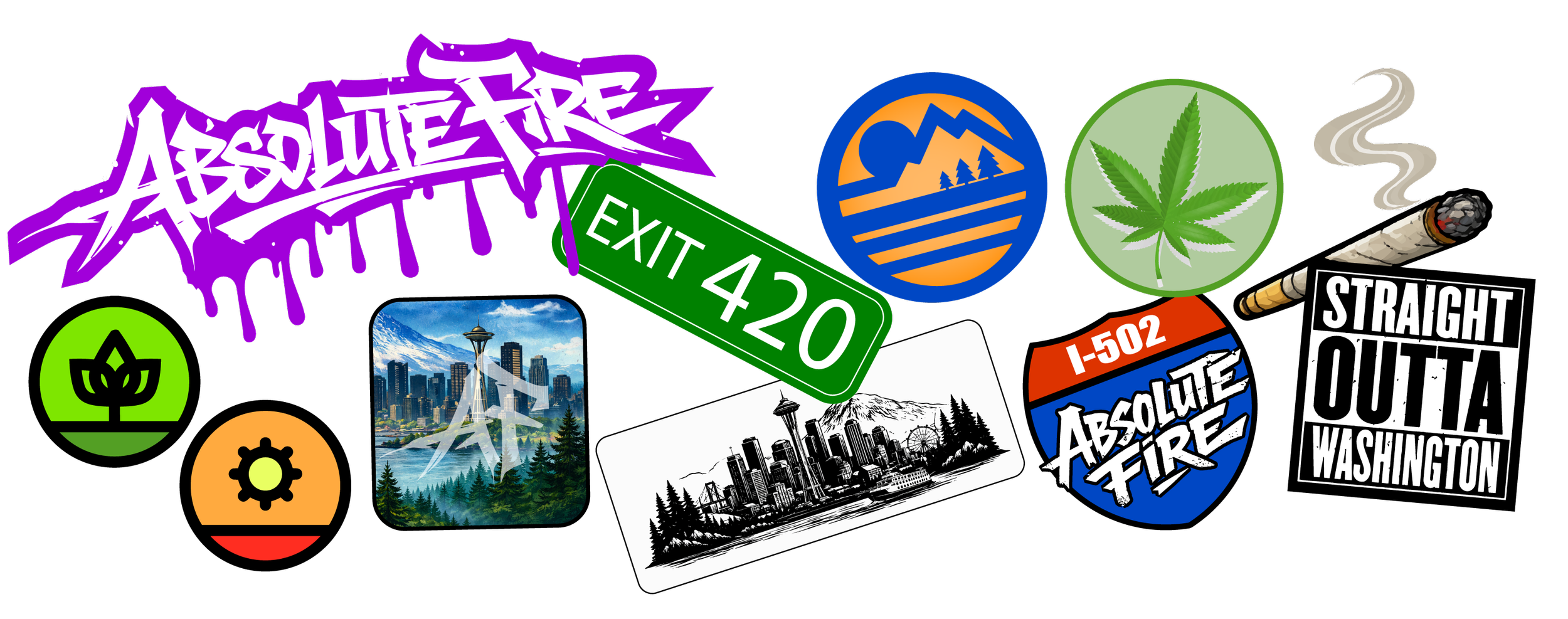
Absolute Fire, is a Washington based cannabis producer that needed a new look for their brand and packaging.
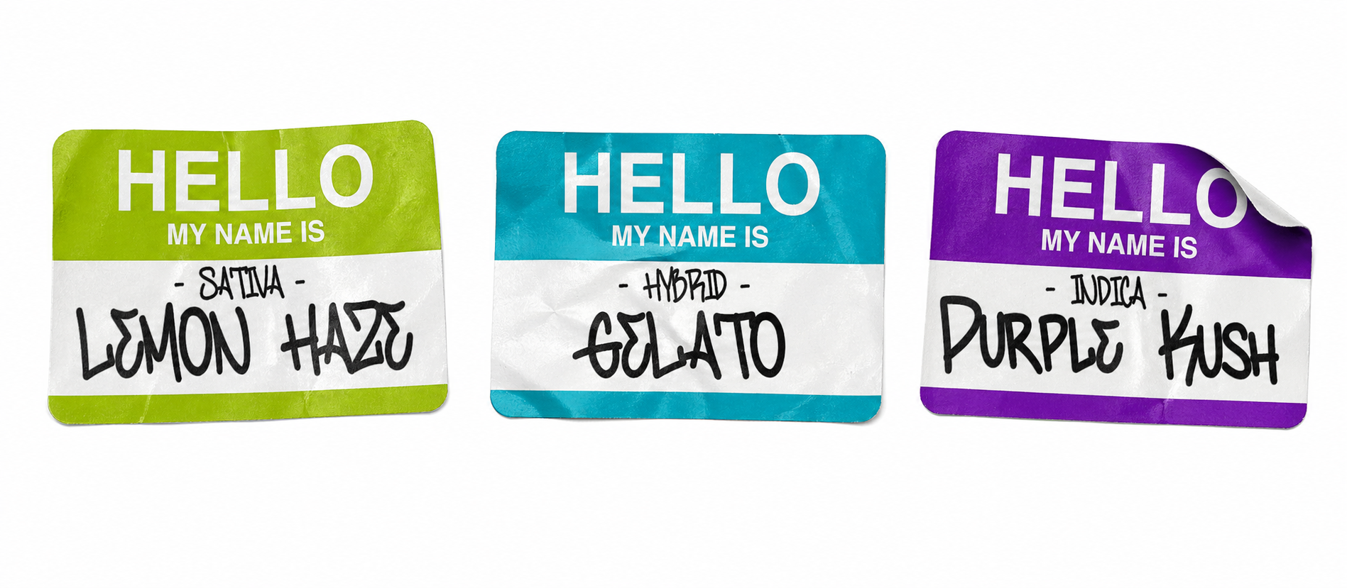
The new direction centers on a sticker-bombed visual language, layered with Washington-inspired easter eggs that reward a closer look. What was once quiet now hits with grit and attitude, evolving into a bold hero brand through a complete overhaul of both packaging and identity.
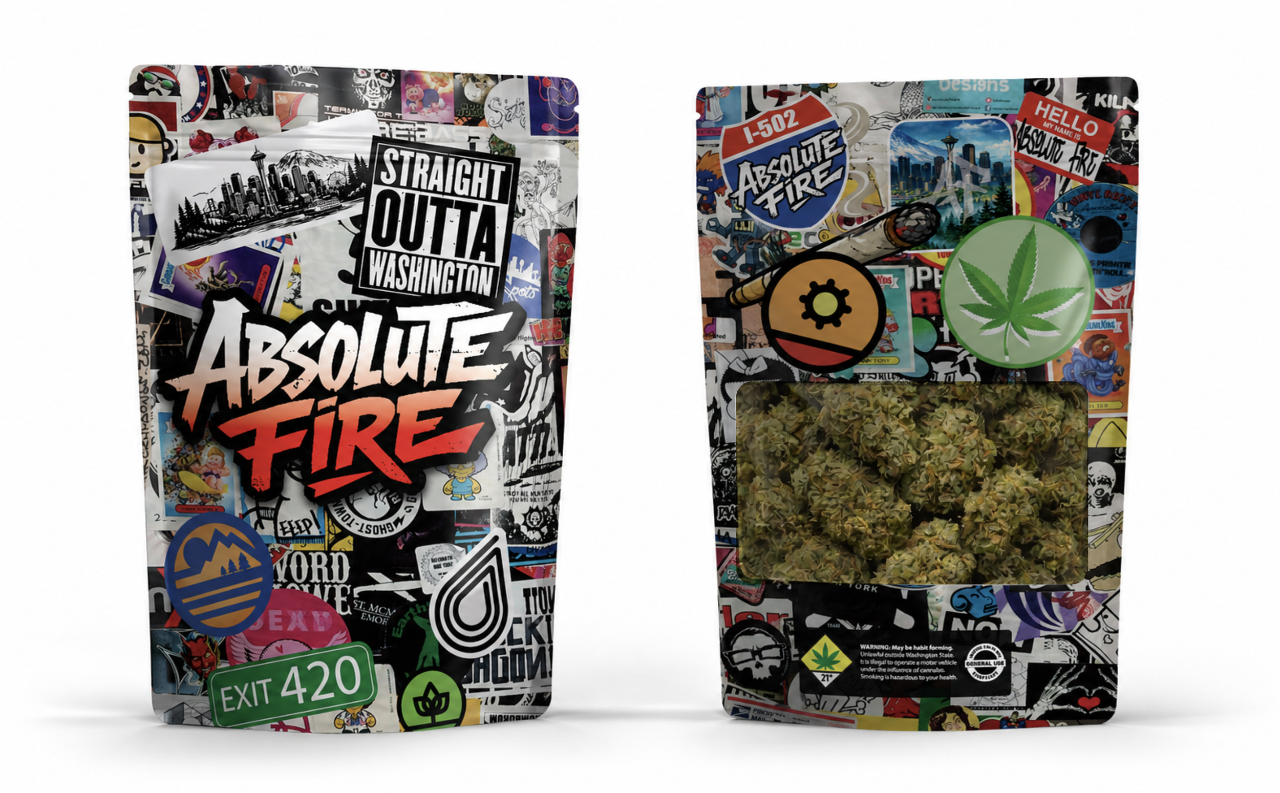
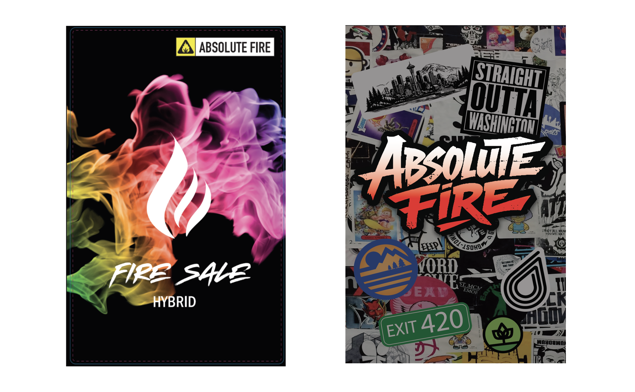
Absolute Fire was launched quickly out of operational necessity. The brand needed to move product, and packaging was created fast to support that goal. While functional, the previous system was not built strategically and did not reflect the strength of the product or the opportunity within the U.S. cannabis market.
Time for change.
→